


/icon%209.svg)
/icon%2010.svg)
/icon%2011.svg)
/icon%2012.svg)
/icon%2013.svg)
/icon%2014.svg)


If you take a close look at some of the world’s most recognizable brands, you’ll notice a common pattern in their visual identity: enclosed, self-contained designs that group text, icons, and dates into a single mark. These are badge logos, and they remain one of the most versatile tools in visual branding.
Whether you are looking to build a brand identity from scratch or launch a special project, understanding how badge logos work can help you decide if one is right for your visual strategy.
What Makes a Badge Logo?
At its core, a badge logo encases multiple brand elements inside a defined geometric shape. While circular designs are the most common, badges can take on almost any form, from traditional shields and crests to diamonds and custom silhouettes.
Most high-performing badge logos share a few key characteristics:
- Central Iconography: The focal point of the badge usually sits right in the middle, featuring an illustration, emblem, or mark that symbolizes the brand’s core product or value.
- Encased Typography: Brand names, taglines, or supporting copy often curve along the inner border of the badge or sit cleanly across the center.
- Visual Separators: To keep text legible and balanced, designers often use small details like stars, dots, or subtle lines to separate distinct pieces of information.
- Heritage Details: Badges are natural containers for milestone years, founding dates, or geographic locations (like "Est. 2010"), instantly adding a sense of credibility and history.
Examining Different Badge Logos
Let's take a closer look at three distinct badge logos that stand out for their unique characteristics.
NASA Badge Logo
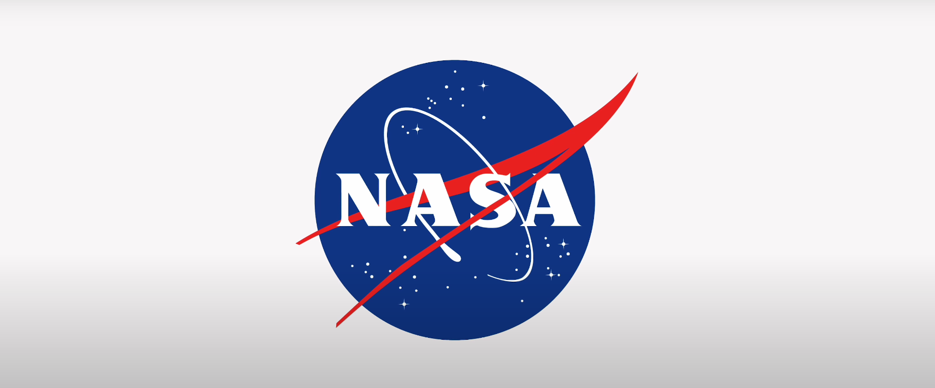
The classic NASA "meatball" logo features a circular blue sphere representing a planet, stars, and a spacecraft orbit line. What makes this badge unique is the vibrant red vector wing that cuts straight through the circular border. It breaks the traditional rule of keeping everything trapped inside the circle, giving the design motion and energy.
Starbucks Badge Logo
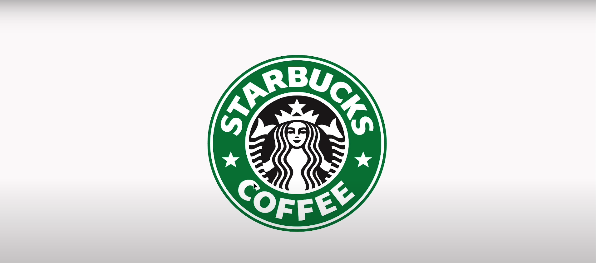
In its earlier iterations, the Starbucks logo was a textbook circular badge. The outer ring featured the text "Starbucks Coffee," separated on either side by tiny stars, while the Siren icon sat in the middle. The stars served a practical function: they cleanly separated top and bottom text while keeping the overall layout balanced. Though Starbucks eventually stripped away the outer ring as brand recognition grew, the badge framework was crucial in building that early identity.
FC Barcelona Badge Logo
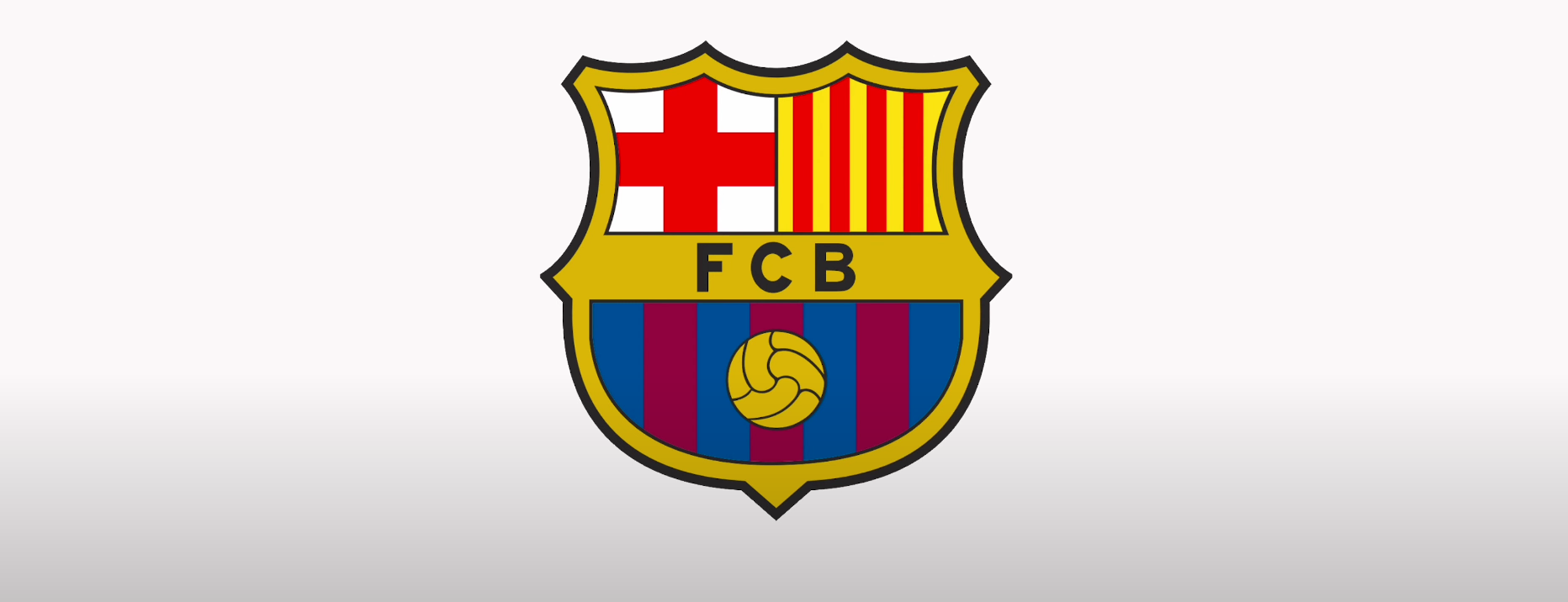
Not all badges are round. Sports teams like FC Barcelona frequently use shield or crest badges. This design fits an incredible amount of story into one shape: a football at the bottom, the team acronym (FCB) in the middle, and regional flags across the top. The shape gives the brand an athletic, institutional feel that a standard flat icon couldn't match on its own.
VIP Marketing 12-Year Anniversary Badge Logo
An excellent example of a milestone badge is the one created by VIP Marketing for their 12-year anniversary. The numbers "1" and "2" in their logo signify the 12 years they've been in business. The years 2010 and 2022 are also included as a more literal representation of this timeframe.
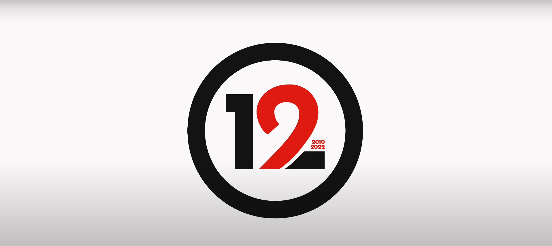
In the center of the badge is half of a heart, symbolizing the love they have for their audience. All these elements are encased within a circle that matches the thickness of the numbers on the outside. This simple yet effective badge was ideal for communicating their message to their audience and was used extensively in their merchandise for the 12-year celebration.
How to Use Badge Logos for Campaigns and Merch
You don't need to completely overhaul your primary brand identity to benefit from a badge logo. In fact, many companies use badges as secondary or campaign-specific visual assets.
For example, when VIP Marketing celebrated 12 years in business, they designed a dedicated anniversary badge alongside their standard branding. They used large numbers ("12") as the central element, flanked by the founding and current year (2010–2022), and framed it with a bold circular border mirroring the stroke weight of the numbers.
Because badge logos are naturally self-contained, they translate effortlessly to real-world applications:
- Merchandise: They look crisp on t-shirts, caps, and tote bags.
- Physical Goods: They fit naturally onto circular stickers, embroidered patches, and enamel pins.
- Social & Web: They make perfect profile pictures and limited-edition campaign badges.
If your brand is celebrating a milestone, launching a limited product line, or just looking for a compact mark for merchandise, a well-designed badge logo delivers instant recognition in a clean, self-contained footprint.
If you need a logo that represents your brand in the most meaningful way, contact us today.